
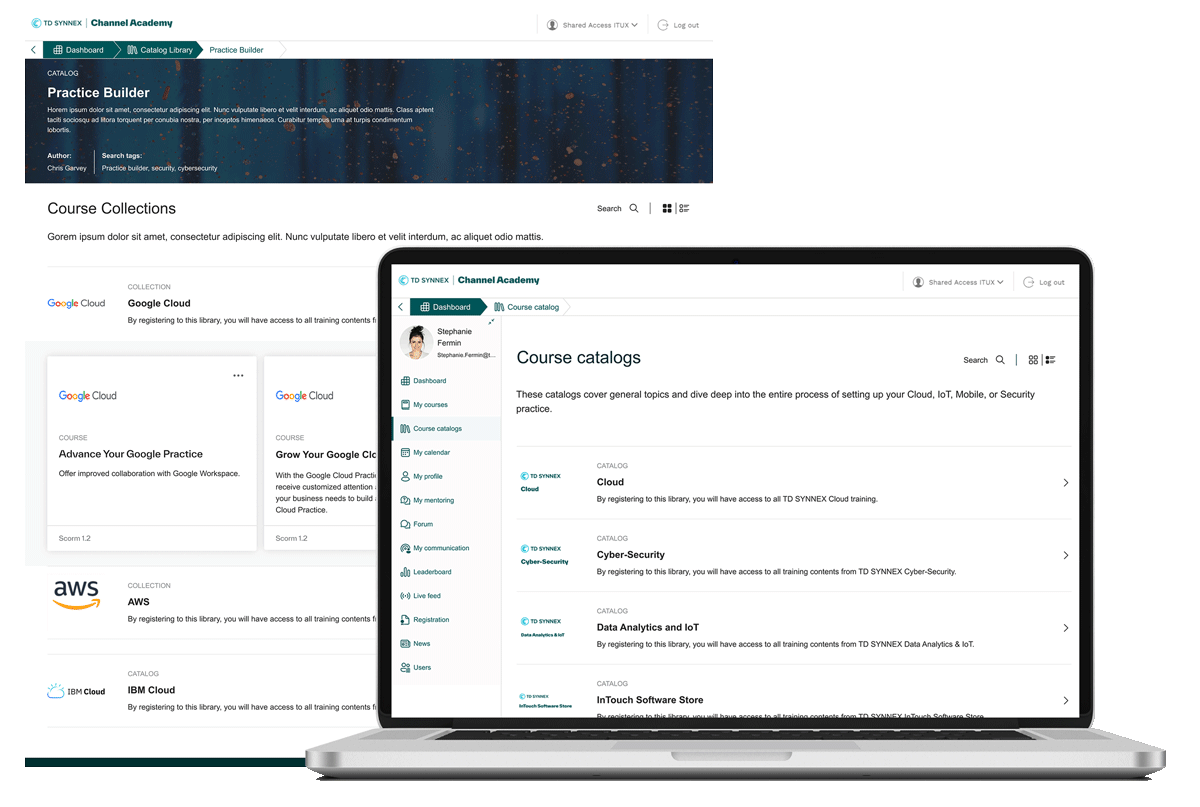
Project Overview
The Product
Channel Academy is an online gateway for connecting with and gaining deeper insights into our extended channel sales community. It’s a free and user-friendly platform designed specifically for our partners, equipping sales professionals with the knowledge and skills needed to enhance interactions with customers and prospects. This enables them to sell more effectively and drive more relevant business engagements.
Project Duration
April 2023 – Present
The Problem
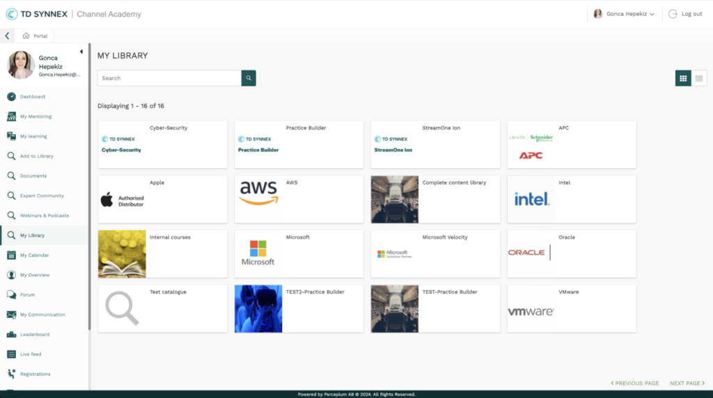
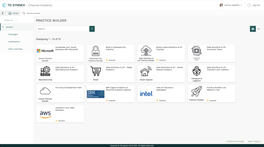
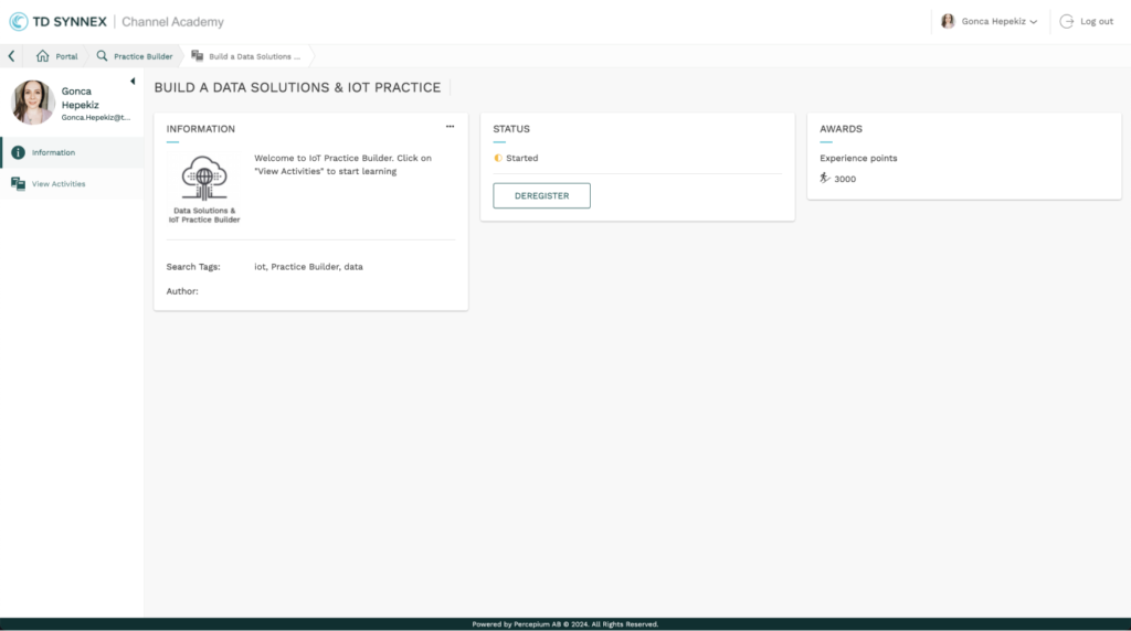
The current platform lacks clarity on how users can navigate and utilize it effectively. All the content is given in the form of endless nested cards without a hierarchy. Users struggle to find and access the resources, and they feel lost while using the platform. This leads to frustration and reduced or no engagement after signing up for the platform.
The Goal
To manage the substantial effort required for this project, we have structured it into three phases. In the initial phase, we focus on streamlining navigation, enhancing discoverability, and implementing a standardized content structure and taxonomy for improved usability.
My Role
UX Lead – Gonca Onusluel Hepekiz
Responsibilities
Keep communication with the feature’s PM, responsible developer, and stakeholders, plan workshops, evaluate workshop outcomes, paper and digital wireframing, review customer satisfaction forms, low and high-fidelity prototyping, accounting for accessibility, iterating on designs, and prototyping.
Understanding the hierarchy and Brainstorming for planning
The challenge
The Channel Academy has been utilizing a third-party learning management platform. We must collaborate closely with the platform owners and respect their existing architecture to implement the necessary changes that enhance platform usability.
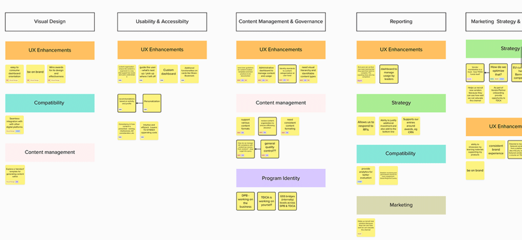
Defining pain points and clustering
Following a workshop with the business team, we identified pain points for each user profile and categorized them into groups to pinpoint areas requiring attention. In the next stage of this workshop, we prioritized each effort and assigned them to specific groups, plotting them on the Feasibility and Importance graph.
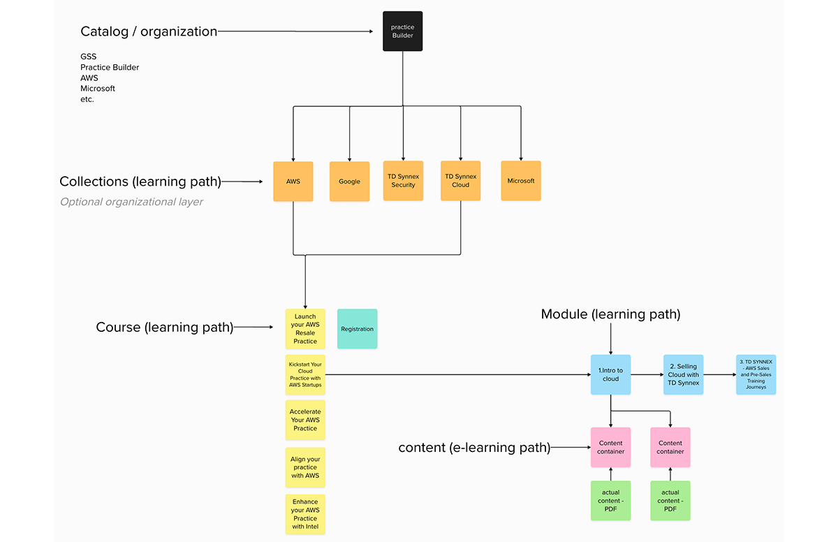
Content hierarchy
The platform lacked content hierarchy and no specific terminology was set up to help users understand the platform’s logic. Additionally, hard navigation creates unnecessary cognitive load for the users. We started to define the hierarchy and set up the terminology after the workshop we had done with the business.
Starting the design
Before commencing the design phase, we thoroughly analyzed and mapped the entire platform, including the administration section. Given that our partners are already using this platform and have populated it with content, we observed consistency issues in content creation, impacting the overall visual experience. To address this, we developed a best practices documentation for content creators, outlining guidelines for achieving a consistent look and feel. This document covers aspects such as logo and image sizing, as well as instructions on setting up banners using custom HTML codes within the system.
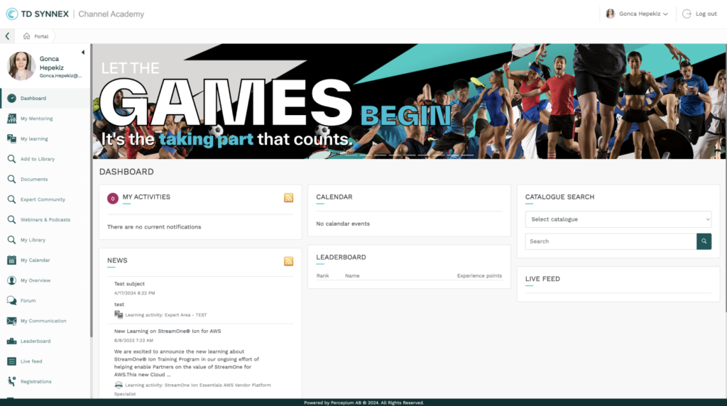
Some screenshots from the platform sections are below:
As-is experience after CSS edits
Concept designs
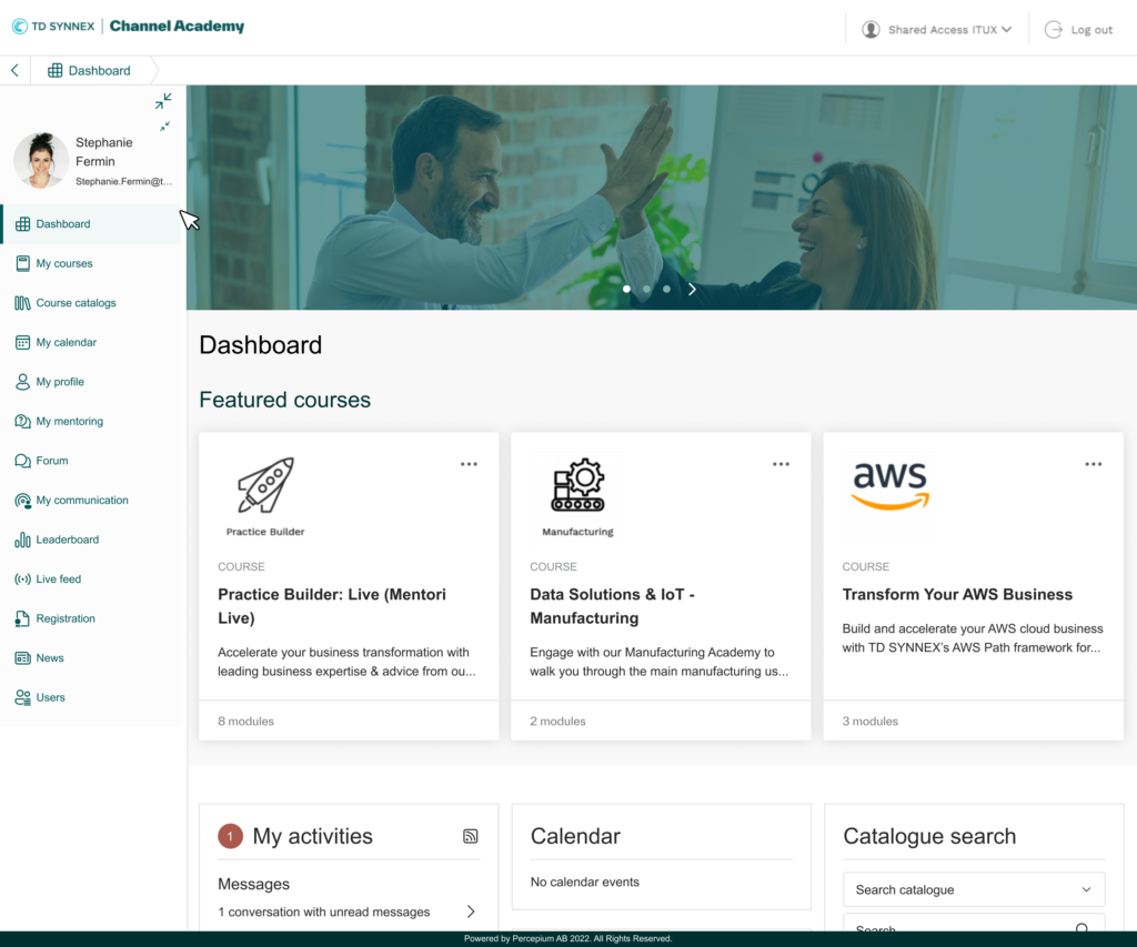
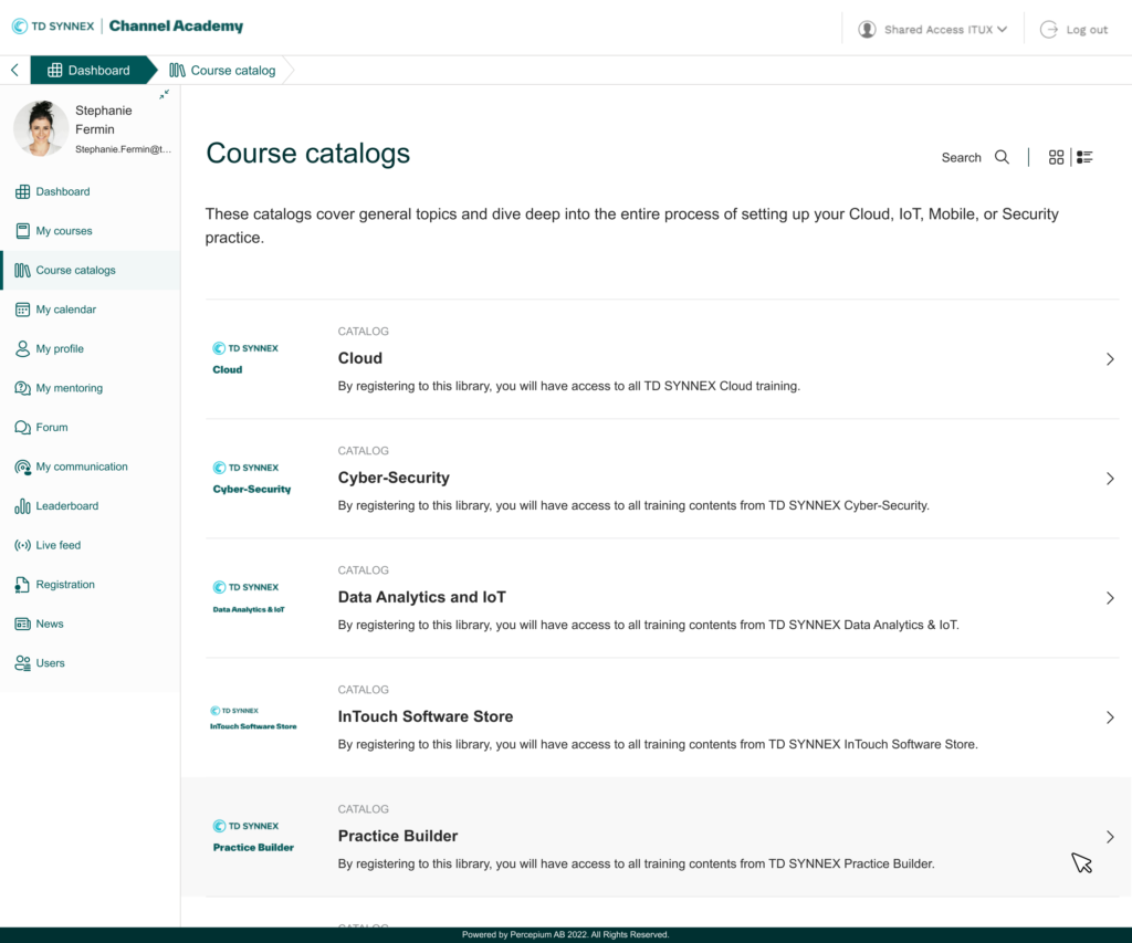
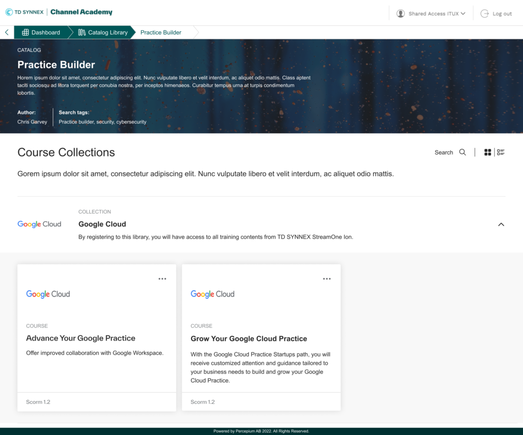
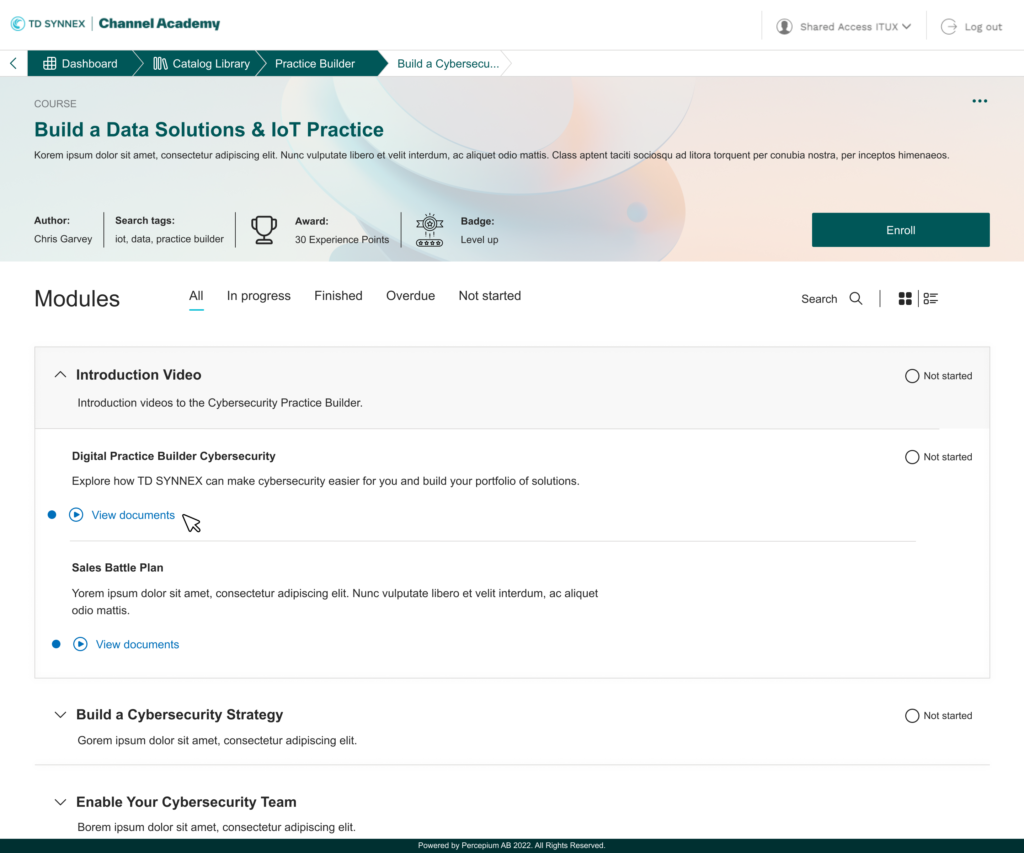
Phase 1 proposal prototype
Please view the recording of the phase 1 proposal prototype. This is ongoing design work that has yet to be concluded.